Fintech Dashboard UI
Most fintech dashboards are either visually cluttered or too stripped back to be useful. This project started as a course exercise redesigning the Wise dashboard, but quickly became an opportunity to build a production-ready UI from scratch using a modern stack.
Role: Design Engineer — UX/UI design, design system, component architecture, frontend development
The problem. Most fintech dashboards are either visually cluttered or too stripped back to be useful. This project started as a course exercise redesigning the Wise dashboard, but quickly became something more, a real opportunity to build a production-ready UI from scratch using a modern stack, and to prove that design and engineering can coexist without compromise.
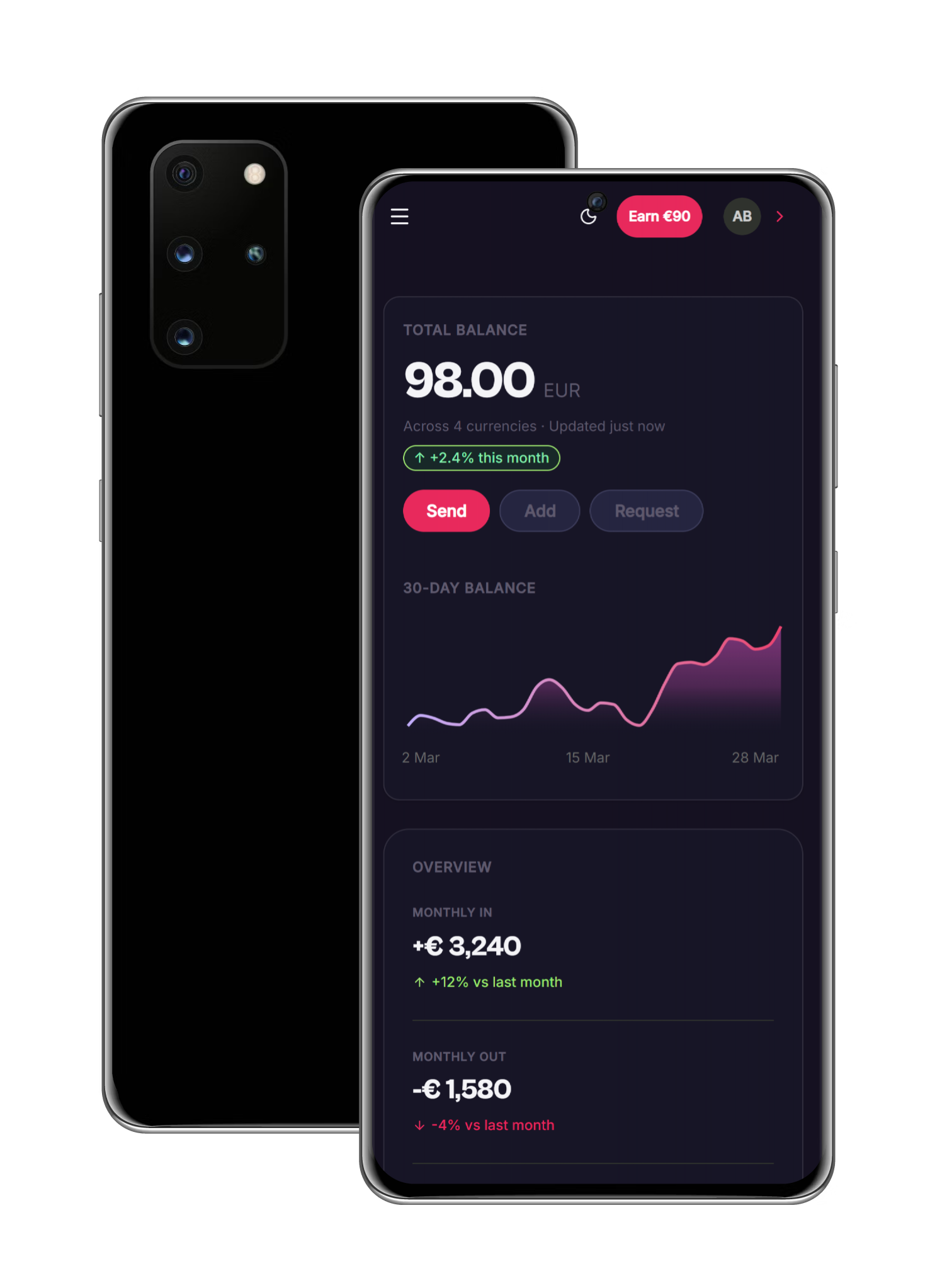
What I did. I redesigned and built the dashboard end-to-end using Next.js, React, Tailwind CSS v4 and shadcn/ui. The work centered on building a small but complete design system. Semantic color tokens, typography scale and spacing primitives, that made both light and dark mode first-class, keeping data and states legible in both themes.
Reusable components for cards, tables and charts were built on shadcn/ui primitives and Recharts, ensuring the UI could grow without becoming a patchwork of one-off solutions. Complex flows were broken into focused views with consistent patterns for filters, summaries and empty states.
The result is a dashboard that reads clearly at a glance, scales as new data and features are added, and is built the way a product team would actually build it.
The result. Live on Vercel. Source code on GitHub. Built to the same standards I would apply to a production codebase.