Leader Linné
Homepage Redesign & Development
Homepage redesign and build for a regional NGO: outdated navigation and clutter made key content hard to find. I simplified information architecture, designed in Figma, and shipped responsive HTML/CSS/JS and Liquid templates—with ongoing client collaboration through to launch.
Role: Design Engineer — UX research, UI design, Figma prototyping, frontend development, QA & testing
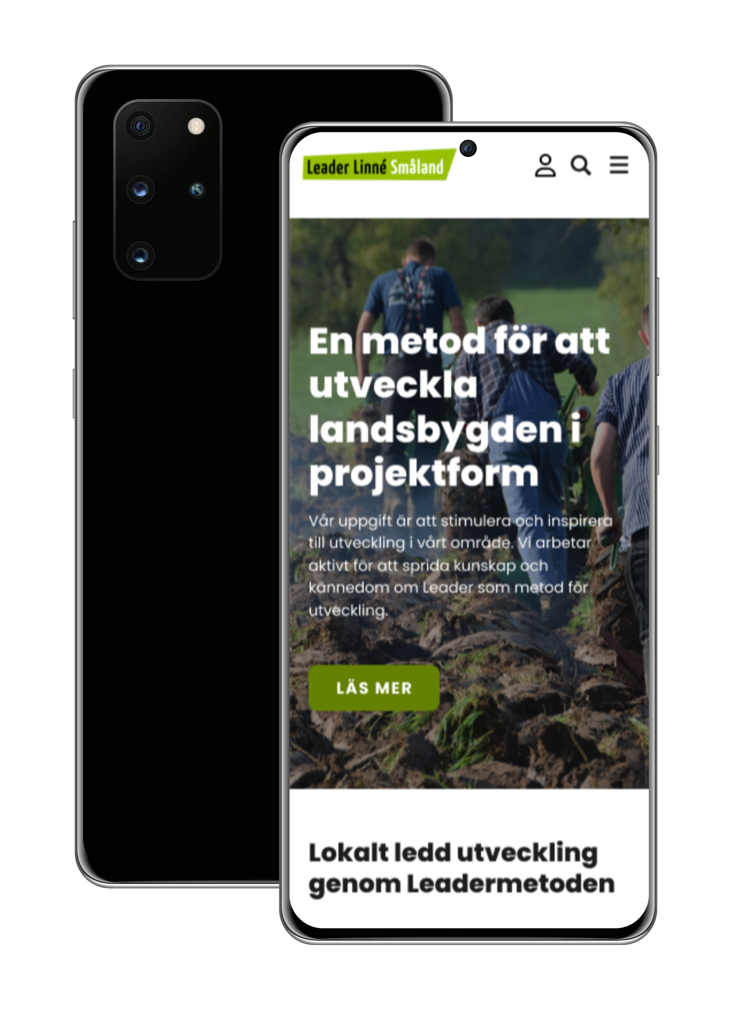
The problem. Leader Linné Småland's website was outdated, cluttered and difficult to navigate. An oversized, unorganised menu with links scattered across every page made it nearly impossible for visitors to find what they were looking for. The client needed a modern, streamlined site that surfaced the most important content, grant applications, ongoing projects and news, without making users hunt for it.
What I did. By combining UX research, UI design and hands-on frontend development, I was able to own the full process from first client call to final deployment.
I started by working closely with the client to understand their business goals, user needs and pain points, gathering insights through interviews and discussions to inform design decisions. I then conducted heuristic evaluation, analysing the existing site and benchmarking against similar organisations to identify structural and usability issues.
From there I simplified the entire site architecture, reducing and reorganising the navigation into clear categories with dropdowns where needed. Priority content, how to apply for grants, what the process involves, news, and current and upcoming projects, was brought forward and made immediately accessible.
High-fidelity prototypes were built in Figma, with a strong focus on crafting a visually modern and intuitive interface that aligned with the client's brand identity. Designs were presented and iterated based on client feedback before moving into frontend development. The approved designs were translated into fully responsive, pixel-perfect pages using HTML, CSS, JavaScript and Liquid templating.
Throughout the project I maintained open communication with the client, gathering feedback at every stage and guiding them through design and development decisions to ensure clarity and alignment. Conducted cross-device and cross-browser testing to ensure a polished, consistent experience before launch.
The result. The simplified navigation and clearer information hierarchy made key content significantly easier to find. Visitors no longer had to search for grant information or project updates, it was front and centre. The client reported positive feedback from users following launch, noting that the site felt modern, easier to navigate and better represented the organisation.