Orbit
A B2B SaaS workspace for product and engineering teams
Role: Design engineering. UX/UI design and frontend development with Next.js 16, React 19, TypeScript and Tailwind CSS 4.
Overview. Orbit is a SaaS dashboard covering the full work loop of a product team: projects, issues, team management, messaging and settings. It takes cues from tools like Linear and Jira, and I built it to show the thing I care most about as a design engineer, which is where UX decisions meet production-shaped frontend code.
I seeded it with realistic data. Seven projects, fifteen teammates, forty-one issues. Every screen feels like a product in use rather than a static mockup, and anything you change persists in the browser, so you can actually work through the app without a backend behind it.
The thinking behind it. I wanted Orbit to answer something harder than "can I build a dashboard". I wanted it to show product judgment, which meant making deliberate calls about scope, information hierarchy, and when to stop building.
Two work models, on purpose. Issues work as a cross-project tracker while board tasks live per project on the kanban. A shared status system keeps them aligned. It mirrors a real architectural tension, since in production these would be one API-backed type, and it shows I understand the data model beneath the UI rather than just the surface.
Knowing where to stop. The My Meetings widget stays empty until you toggle Google Calendar on in Settings, instead of faking a full calendar integration. I read through the actual Google Calendar API docs and made a call: a half-built OAuth flow would weaken the project more than a well-scoped placeholder with clear production intent. Scoping is a senior skill and I wanted it visible.
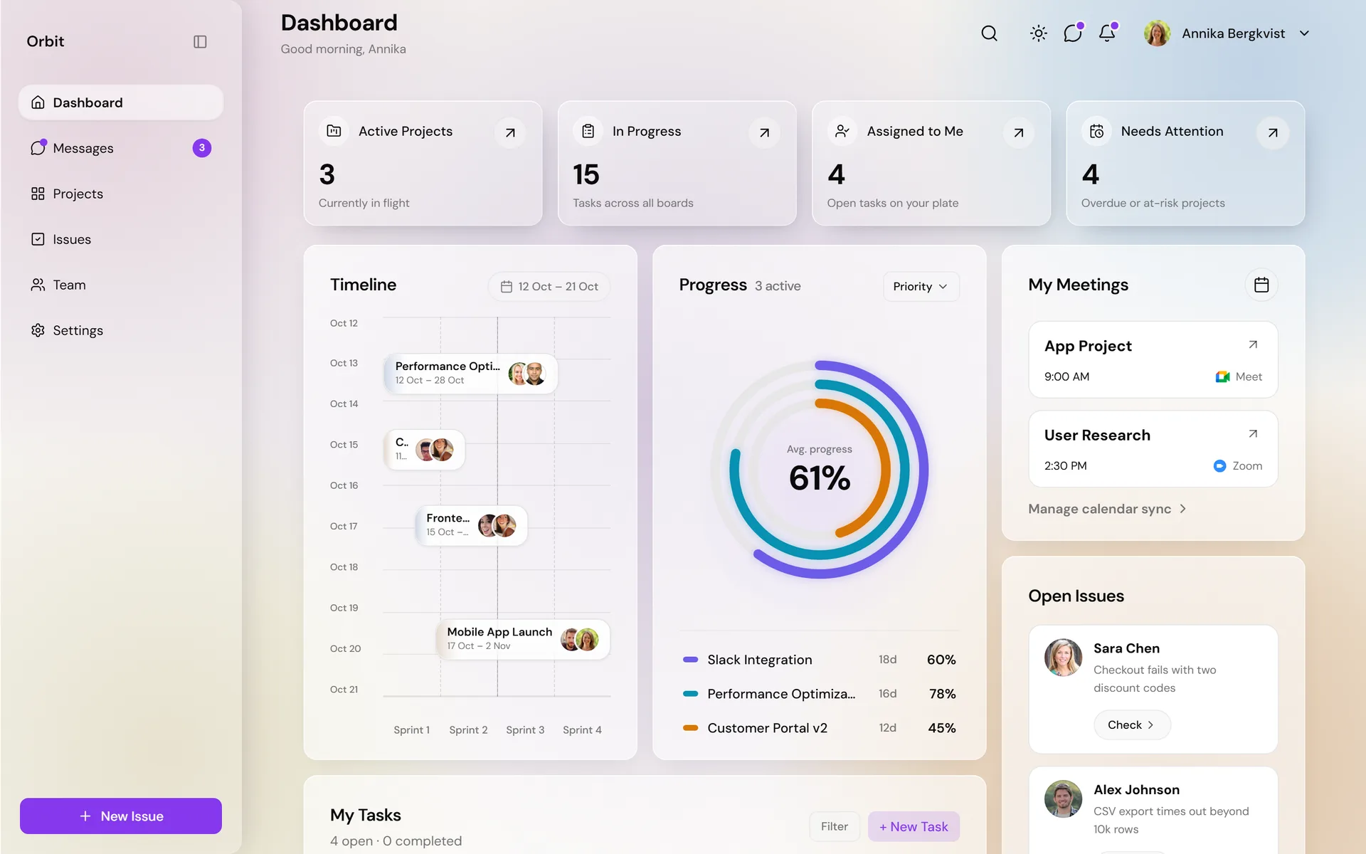
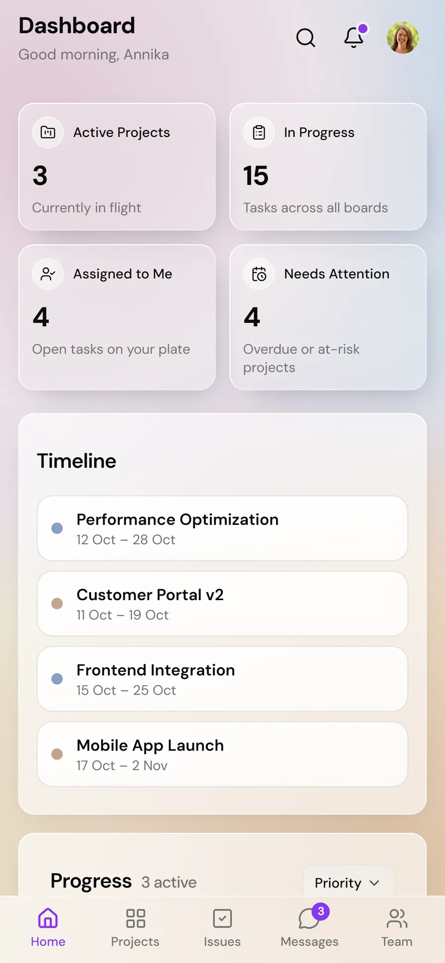
Actionable over decorative. KPI cards show secondary context like "2 due this week" or "1 due today" instead of vanity percentage trends, and they deep-link into pre-filtered views. The team page computes real workload from assigned issues, so a lead can spot who's overloaded at a glance. Every data point has to change a decision to earn its place.
What I built. A signed-in workspace across eight routes, each with its own considered layout.
- Dashboard with KPIs, a sprint timeline, progress rings, meetings and an issue feed.
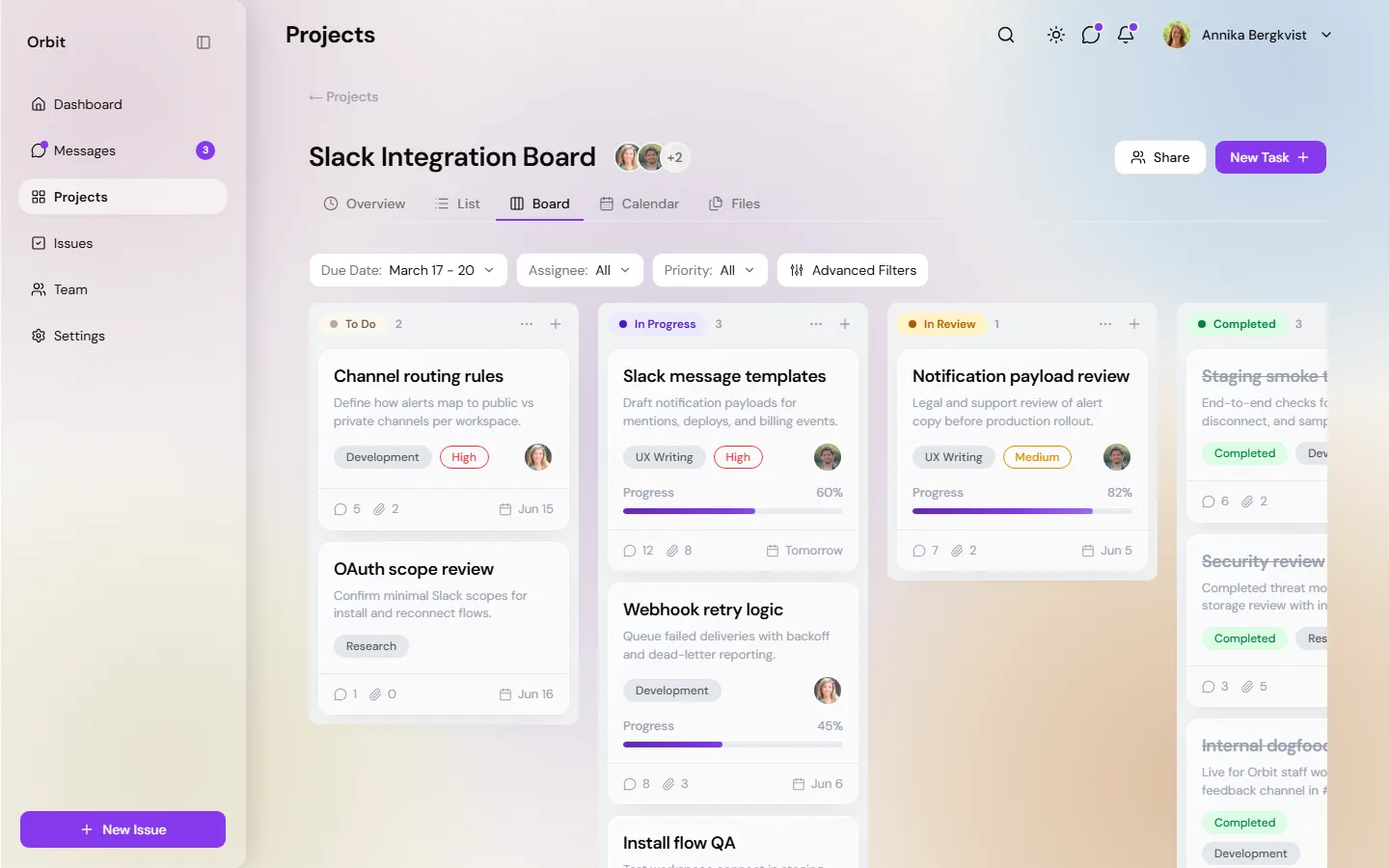
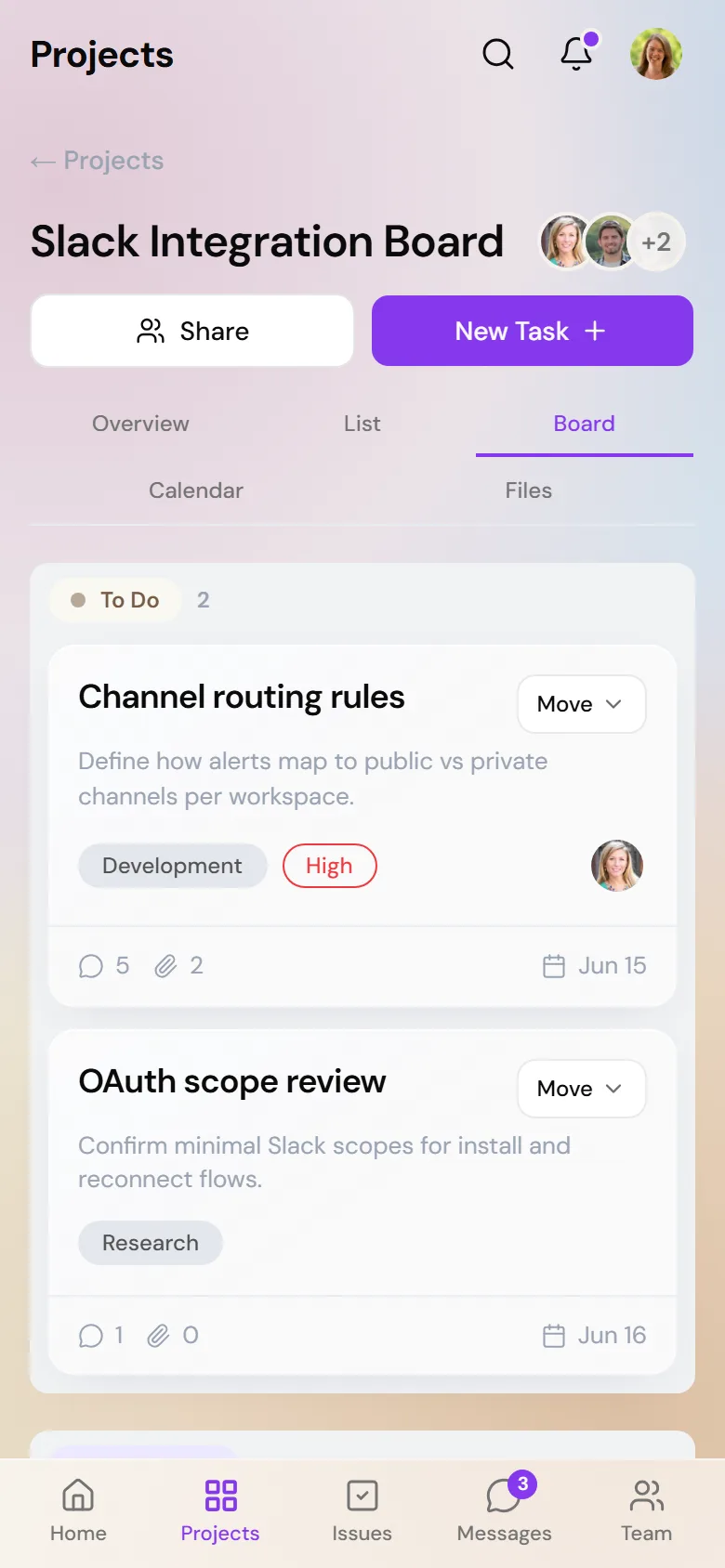
- Projects as a filterable card grid that opens into per-project boards with a full drag-and-drop kanban, built with dnd-kit and operable by pointer or keyboard.
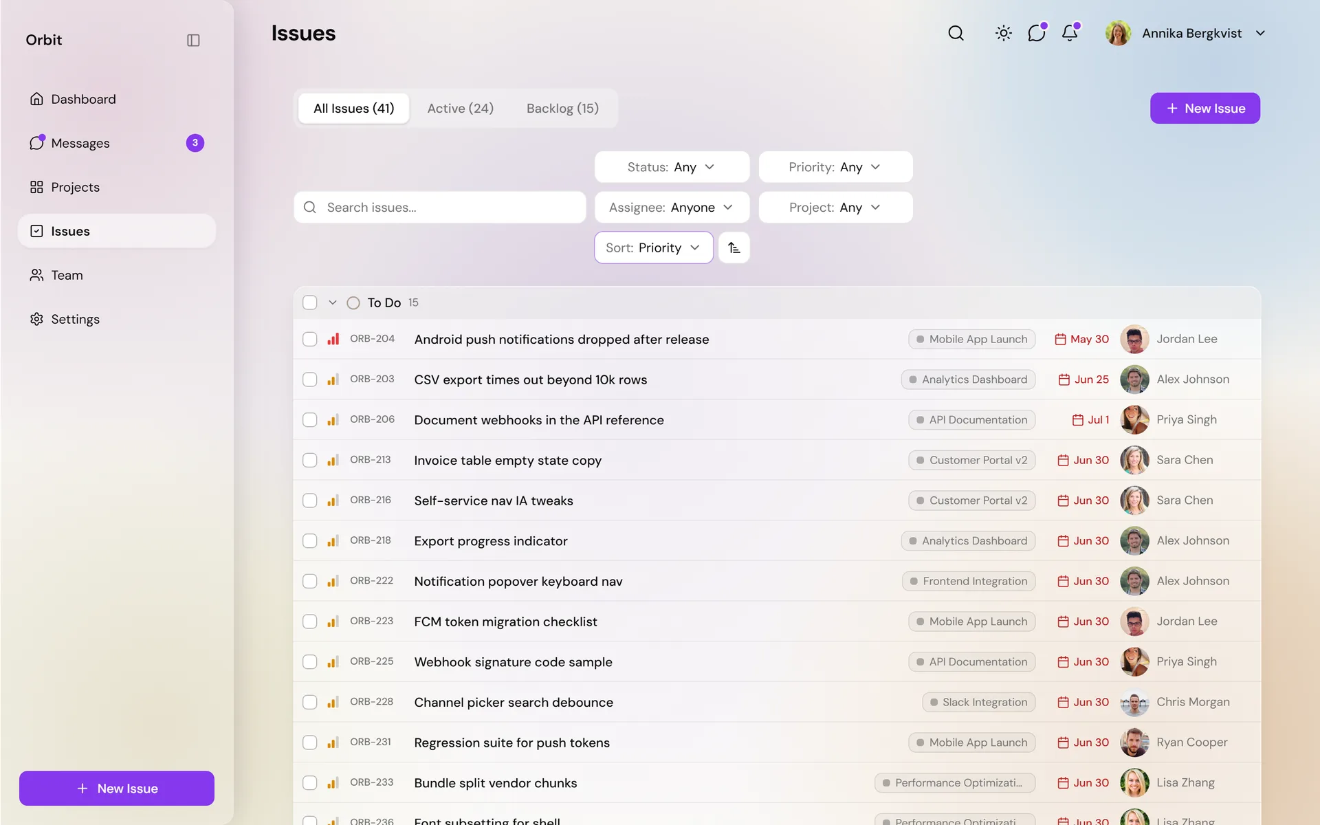
- Issues as a filterable backlog with URL-persisted state, bulk actions and a slide-over detail panel.
- Team with computed workload indicators, presence and member detail.
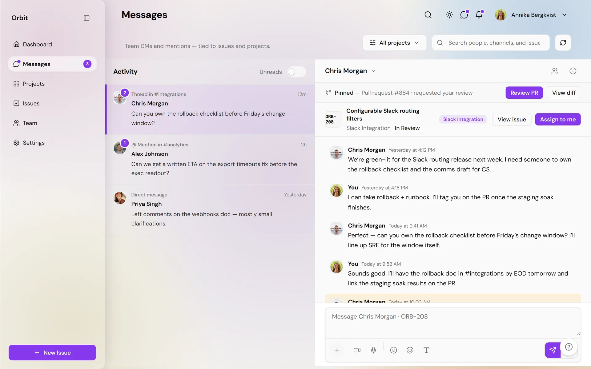
- Messages, plus a five-section Settings area covering theme, density and reduce-motion controls.
The interface deep-links throughout. KPIs open filtered lists, team members link to their own issues, so the product feels connected instead of a set of isolated pages.
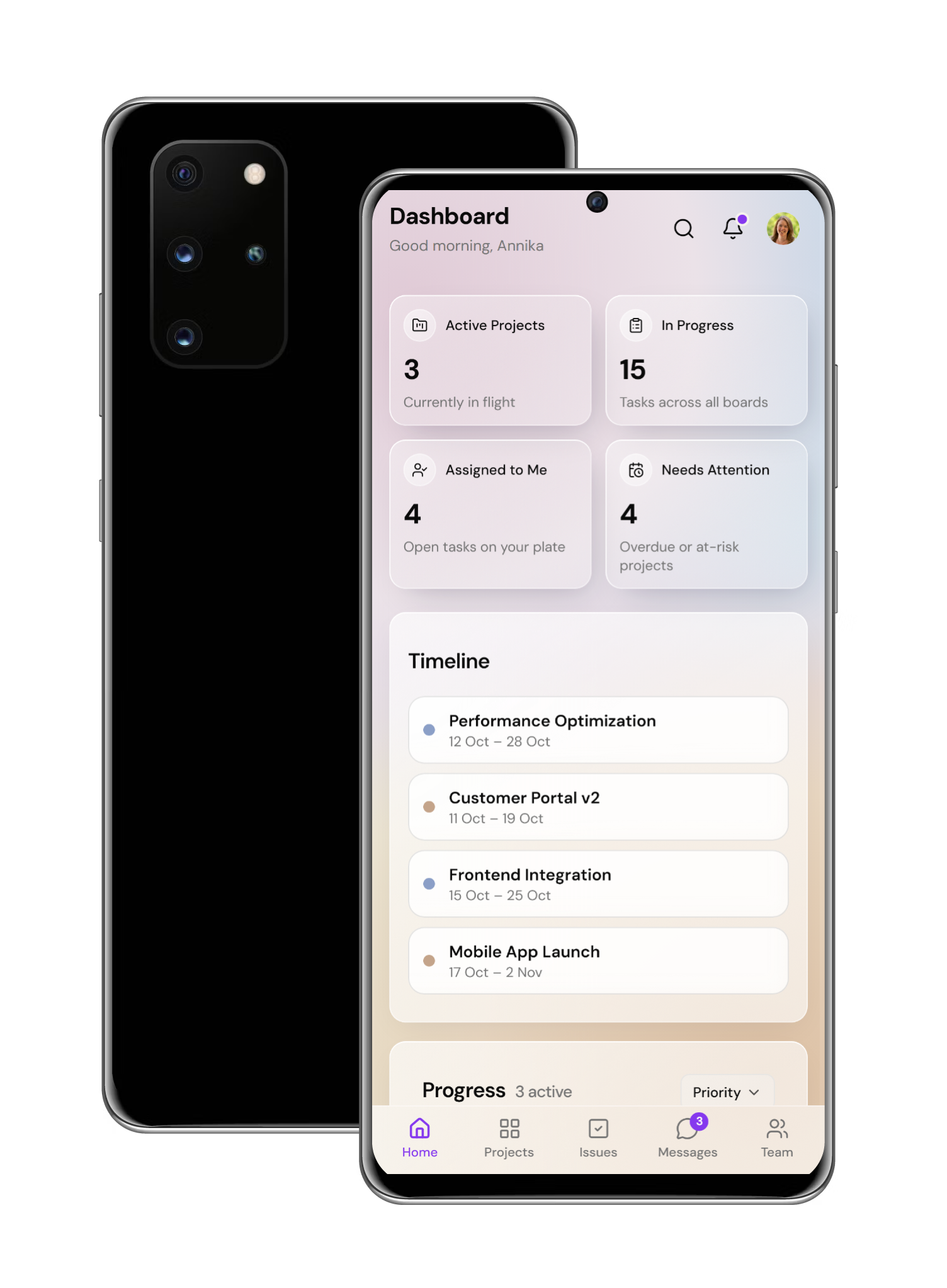
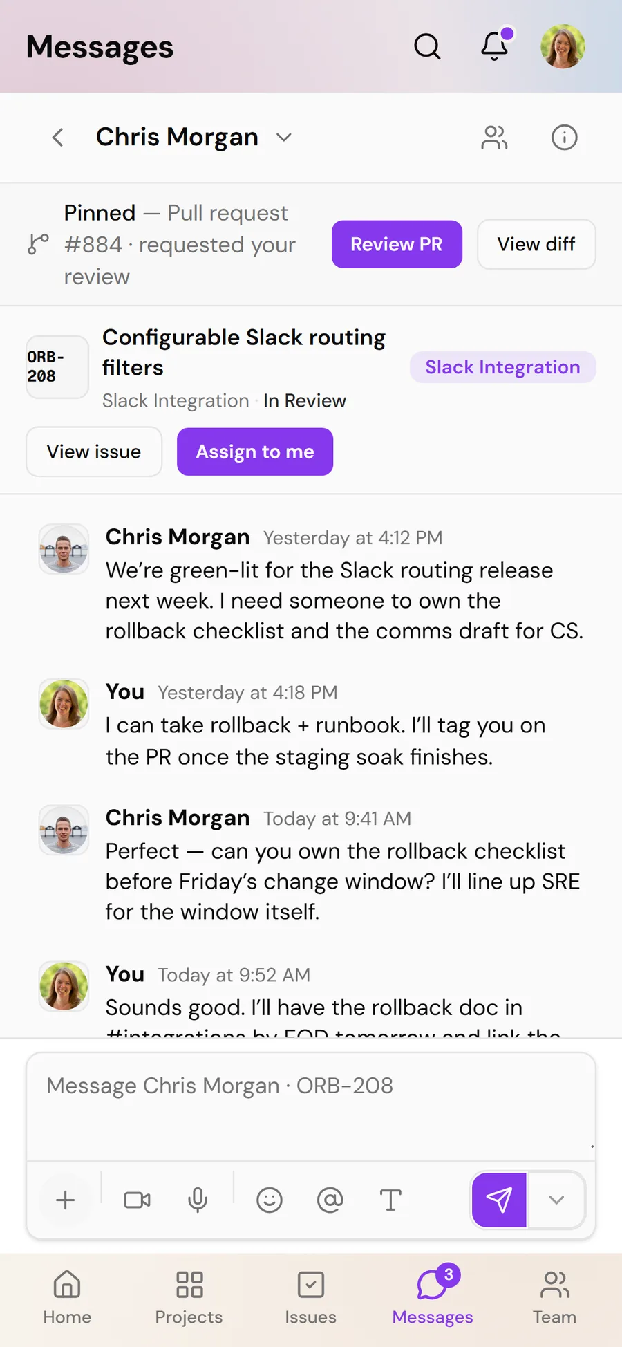
A dual-surface product. Orbit isn't a desktop layout squeezed onto a phone. It's two deliberate surfaces sharing one codebase. Desktop keeps a collapsible glass sidebar and multi-column boards. On mobile it becomes a product app: a five-tab bottom bar, safe-area insets, compact headers, full-screen dialogs, filters and profiles that open as sheets, messages that switch between inbox and thread, and a kanban that stacks into vertical columns with explicit Move actions instead of drag-and-drop.
It's a responsive web app with installable web-app hints, so Add to Home Screen on iOS lets it sit on a device like an installed app. It isn't a native binary. I designed and coded both surfaces in the same Next.js project, matching interaction patterns to each device. Same data, same workflows, navigation that suits the screen. That's the product thinking I'd bring to any role hiring for web and mobile product UI.
Challenges I solved.
- Keeping two work models coherent. The hardest design problem was letting issues and kanban tasks coexist without the product feeling split in two. I unified them under a single status system and made the project list view merge both, so a project still reads as one backlog even though two data models sit underneath.
- State that persists without a backend. Instead of reaching for Redux or React Query I built a small pub/sub store. Write to localStorage, fire an event, let hooks subscribe, with cross-tab sync through the storage event. It gave the app real persistence and reactivity at a fraction of the complexity, and it forced me to think clearly about what state actually needs to be shared.
- A design system rather than a pile of styles. Early on the badges, colors and surfaces drifted apart across pages. I consolidated everything into tokenized systems, giving status, priority and category pills each their own visual language, building a real glass surface system, and moving color to OKLCH. Getting there meant a full audit and refactor rather than patching page by page.
- Making filters shareable and durable. Issue filters live in the URL, so a filtered view can be linked, bookmarked and deep-linked into from the dashboard KPIs. That meant syncing URL state with UI state carefully, without fighting the Next.js App Router.
Craft details.
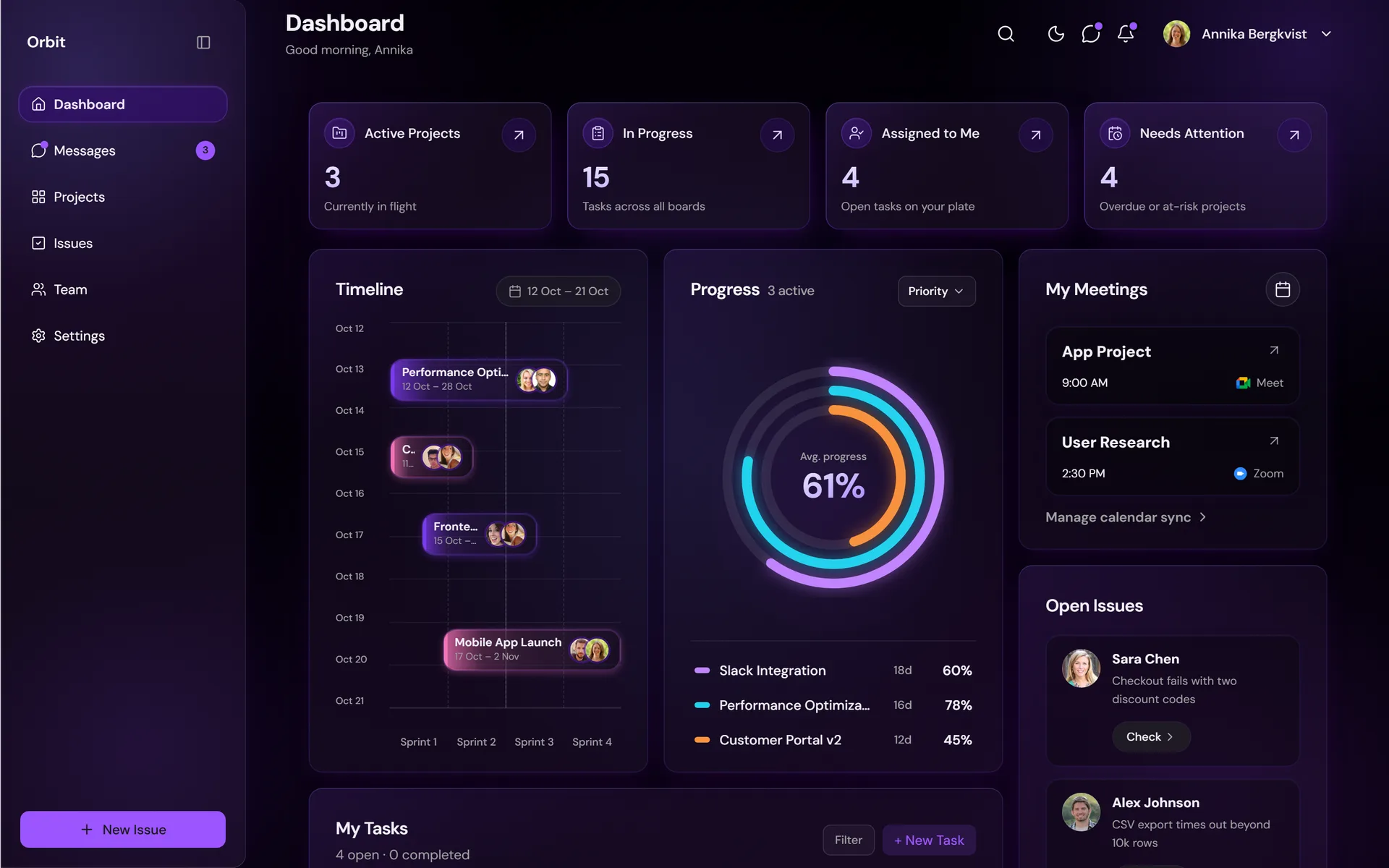
- A real glass system. Not a blur class. Rim light, dual shadows, SVG noise texture and a diagonal sheen, tokenized into reusable surfaces. Warm ivory mesh in light mode, deep violet in dark, brand purple defined in OKLCH.
- Accessibility and motion treated as first-class. Tokenized focus rings, a keyboard-operable kanban, and a reduce-motion setting that's a genuine user preference rather than only an OS mirror.
Stack. Next.js 16 (App Router), React 19, TypeScript in strict mode, Tailwind CSS 4 with OKLCH tokens, shadcn/ui and Base UI, dnd-kit, Recharts, next-themes.